
OTC Research Tools Website Update
UNC Innovate Carolina’s Office of Commercialization Technology [OTC] helps translate the University of North Carolina at Chapel Hill’s inventions and findings into the commercial marketplace.
The redesign of Innovate Carolina’s OTC Research Tools website focused on delivering a clear information hierarchy and minimalist aesthetic to improve usability and user engagement.
As a contract UX Designer & Engineer for Innovate Carolina’s Office of Commercialization Technology, I led the redesign and redevelopment of the Research Tools website.
The goal was to replace a third-party platform with an independent site featuring modern front-end and back-end architectures, directly integrated with the internal “Blue” server for real-time data updates.
BACKGROUND
User Needs + Features
I conducted interviews with clients and users, then developed personas highlighting needs for accessibility, concise layouts, and a clean aesthetic.
Stakeholder Type Users
(mid-high level knowledge of the site content)
New/Browsing Type Users
(low-mid level knowledge of the site content)
Have a general sense of their target and benefit from search, filter, and sort functions (keywords, categories, inventor names, IDs).
Require concise layouts to browse technologies confidently.
Need functions or features that allow them to seek specific tools, technologies, or inventors rapidly.
Creating streamlined access paths for efficient information retrieval.
Benchmarking our goals and ideas against university tech-transfer sites and identifying key features that would be of use to us:
Problem Statement
Clear information access for diverse user groups
Using titles, keywords, IDs, inventor names
FLEXIBLE FILTERING
INTUITIVE INTERFACE
Introduce filters, tags, and enhanced search.
Transition data hosting from a third-party platform to UNC’s “Blue” server.
Using categories, subcategories, tags
SORT OPTIONS
Date, title, relevance // Sort view in columns or grids
I also used Jacob Nielsen’s Heuristic standards to understand which aspects of the site need the most attention, and which are working well currently.
Using the research I collected from the client, user type, & business evaluations, I defined the client's needs in a single statement.
Users of the OTC Research Tools Website require information and features to be concise and accessible to efficiently search, browse, and locate the desired technology/tool.
Competitive Analysis
DISCOVER & DEFINE
Client Needs & Goals
For their Research Tools site to be efficiently updated, the client wanted to address these design elements:
MODERNIZE AESTHETICS
Simplify styles and layouts while preserving accessibility.
BACKEND TRANSISTION
Innovate Carolina OTC Competitor List
University of Maryland UM Ventures

Vanderbilt Technologies
University of Pennsylvania Tech Publishser

UC Davis Technology

Heuristic Analysis
ACCESSIBLE INFORMATION
ROBUST SEARCH ENGINE
DESIGN & DELIVER
Low/Mid Fidelity Sketches
After completing the user & business research portion of this project, I sketched out numerous wireframe layouts to see what designs would work best with our findings & goals.
-
![Home Page Sketch 1]()
Home Page Sketch 1
-
![Home Page Sketch 2]()
Home Page Sketch 2
-
![Home Page Sketch 5]()
Home Page Sketch 5
-
![Home Page Sketch 7]()
Home Page Sketch 7
-
![Info Block Sketches 1-3]()
Info Block Sketches 1-3


After sketching, the initial wireframes of my design were iterated upon & the final prototype was approved by the clients.
Usability Testing & Results
-
There were two usability tests that were conducted for this project; both were useful in understanding where users were having trouble and where they were having success on the Research Tools Site.
These results of these tests allowed the prototype to be refined each time, creating a final prototype that would provide the strong foundation for the front-end development portion of the project.
-
Navigation Confusion: Participants struggled to locate the homepage from secondary pages, indicating unclear or inconsistent wayfinding.
Positive Visual Feedback: Users responded favorably to the updated visual design, noting improvements in aesthetics and overall interface appeal.
Technical Constraints: The testing environment limited access to key interactive elements such as dropdown menus and the search bar, which may have impacted task performance and user flow.
-
Successful Task Completion: All participants completed the assigned tasks, indicating improved usability and interface responsiveness.
Clear Instruction Comprehension: Users demonstrated a strong understanding of the test objectives and instructions, which contributed to a smoother session flow and more reliable feedback.
Innovate Carolina OTC User Interface Kit
I then ran a few rounds of usability testing to see how new and old users would interact with our new design for the Research Tools Site.
I compiled a UI Kit to organize font types, weights, & sizes, and branding colors used in my dsign for the client reference.

Innovate Carolina OTC UI Kit
DEVELOPMENT
HTML, CSS & JavaScript
Once designs were finalized and approved, I implemented the front end using HTML, CSS, and JavaScript in Visual Studio Code. Collaborating with ORIS backend developers, we integrated UNC’s “Blue” server (ColdFusion) for data retrieval.
I additionally translated Figma prototypes into structured HTML and CSS layouts, then added search, filter, and sort functionality via JavaScript. Joint code reviews with the whole team ensured alignment with user requirements and client expectations.
Figma
VSCode

UNC Innovate Carolina Office of Technology
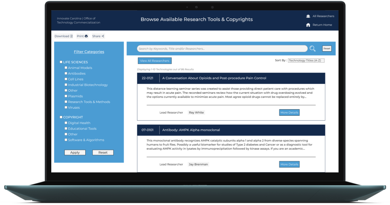
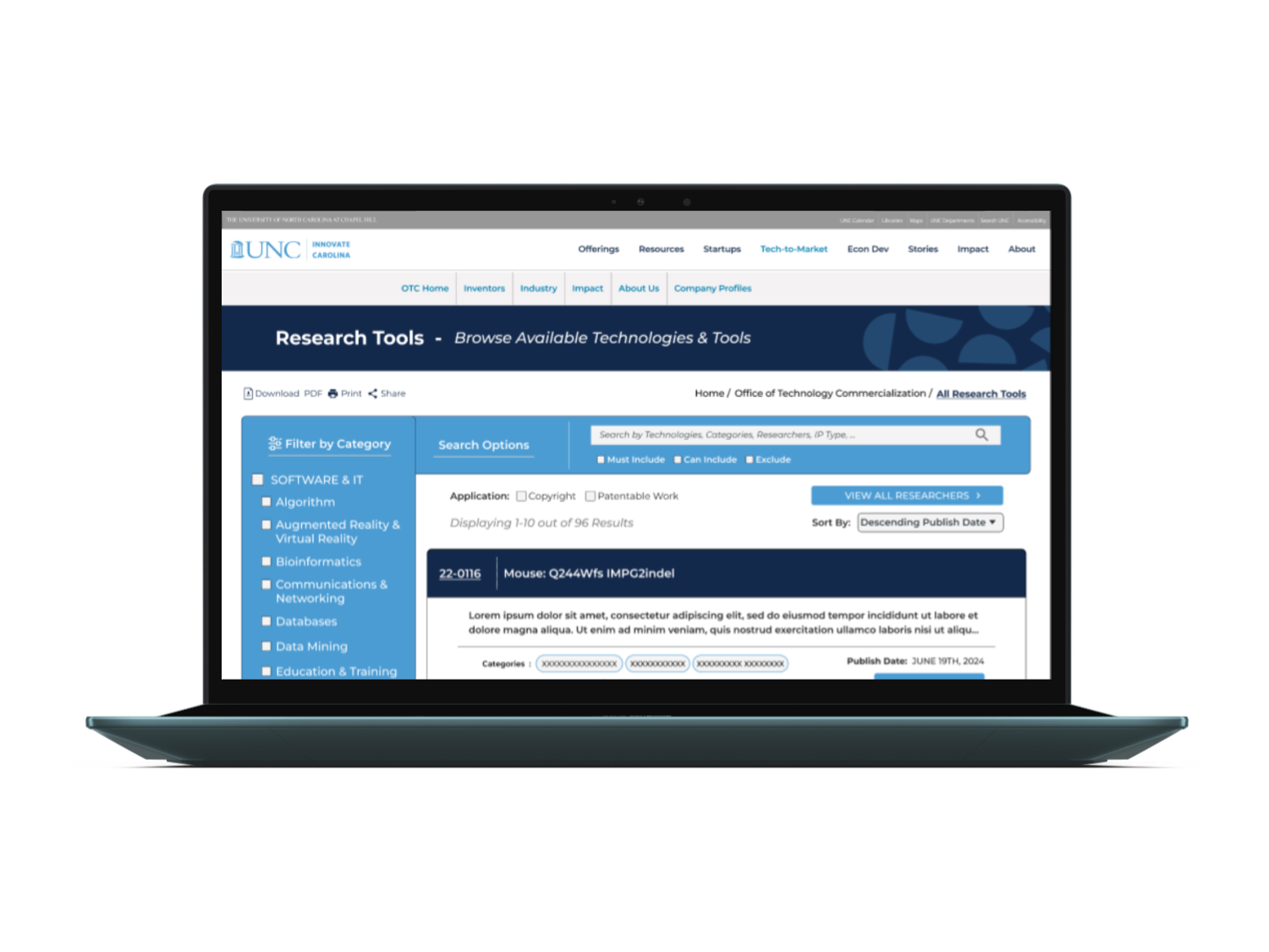
Innovate Carolina OTC Final Design Mockup

SITE BEFORE & AFTER COMING SOON…
Through multiple design and code iterations—validated by usability testing and stakeholder reviews. Our team's effort allowed us to push our designs even further than initially expected, delivering a modern, fully functional Research Tools website that met all objectives
CONCLUSION
THANK YOU FOR CHECKING OUT MY PROJECT!
If you would like to chat about my work, just reach out to me!
During this project, I acquired hands-on, complete front-end development experience alongside UX design. I learned to embrace flexible iteration cycles to accommodate last-minute adjustments. The importance of organized code and detailed design templates was also a methodology that was reinforced for me. In the end, I benefited greatly from cross-functional mentorship and collaboration with developers, clients, and uses.
“… Maya demonstrated excellent technical and design skills, creating a visually appealing and highly functional website with a user-friendly interface that captured our vision.
She was responsive to feedback, met deadlines on time and on budget, and demonstrated initiative in suggesting improvements that enhanced the final product. Her communication was clear and consistent throughout the project. I highly recommend Maya for any web development projects and would gladly work with her again.”
Chance Rainwater, Senior Commercialization Manager
CLIENT REVIEWS
“Maya… worked closely with our team to transform our vision into a polished, user-friendly site in alignment with our expectations and goals. I’d welcome the chance to work with her again and wholeheartedly recommend her for any web development needs. “
Michael Adoff, Commercialization Manager